Tuesday, March 15, 2011

Week 11: Sea Joy

When it comes to art, sometimes it helps to just stop thinking rationally at all, which is how I came up with the idea of a huge seashell with a girl on top of it. This isn't a project to imitate step-by-step - you'll want to come up with your own irrational art idea - but the various mixed media techniques we'll explore in this project can help you get there.
What You Need
For the painting and background:
For the image transfer:
  • gampi paper (available from FineArtStore or Flax in the San Francisco Bay area)
  • workable fixative (Krylon)
  • gloss polymer medium (Golden)
For the mixed media elements:
  • light modeling paste (Liquitex)
  • small unfinished wooden boxes (available at craft stores)
  • gesso
  • craft glue (Mod Podge or Aleene's Tacky Glue)
  • embellishments: rocks, seashells, yarn
  • pigment powder (Perfect Pearls)
Some of the materials needed, clockwise from left: polymer medium, gesso, workable fixative, light modeling paste, pigment powder
Working with smooth gessobord, we'll create a painting and collage that melds several mixed media techniques. We'll transfer an image using gampi paper, add texture to the smooth board with modeling paste, and add dimensionality with sea-themed objects inside small boxes.

Start by gathering the items you'll be using, and placing them on the board in roughly the position you want. Here, I have a paper poseable figure and a smaller printed version of the nautilus shell.
Find and place your objects for a rough composition
Next, we'll work with a new image transfer technique: transfer using gampi paper, which is a very lightweight paper that seems to melt right onto the surface you adhere it to. This technique creates a perfect inkjet image transfer; I learned this from Darlene McElvoy and Sandra Wilson's Image Transfer Workshop book.

Cut your gampi paper to slightly smaller than the size of a sheet of printer paper and scotch-tape it to the edges. I printed out half the seashell on one page and half on the other so that the image would be larger.

Spray the image with a coat of workable fixative, which allows you to then work with it, paint over it, and protect it. I'm chemically sensitive, so I use a heavy-duty face mask and spray it either in the garage or outdoors. Let the image dry and the fumes disperse.
Image printed on two sheets of gampi paper
The nice thing about painting on smooth board is that you can add your own texture using modeling paste, rather than being limited to the texture of canvas. I wanted the seashell to pop out of the background, so I applied a few coats of modeling paste in the shape of the seashell, letting each coat dry overnight before applying the next coat.
Adding texture with modeling paste, using a palette knife
Next, rough in the background colors using acrylic paints. I started with light watery washes of transparent colors for the ocean and sky, and then built them up in several different sessions, adding more color and texture. Once the background was painted, I cut the seashell image out and affixed it to the seashell-shaped area of modeling paste with polymer medium, which is a very thin acrylic medium. The paper is so thin that any color added to the background will show through, so I kept the modeling paste background white.
Starting to add in the ocean and sky
Here's a "first draft" of the painting. The sky ended up being too purple, which clashed with the colors of the poseable figure.
Once the sky and ocean were painted, I added texture to the waves with modeling paste and, using tape, temporarily placed the figure and boxes to check the placement.
When I was happy with the placement of the boxes, I painted them with gesso to prime them, let them dry, then glued them to the board with Mod Podge collage glue.
Painting the boxes with gesso
To add more interest to the composition, I added diagonal lines for the waves and the sandbar. After posing the figure on the shell and affixing her with earthquake putty, some multicolored slubbed yarn became her hair. And inside the boxes you'll find a fossil ammonite and a sparkly rock, purchased several years ago from Jackalope in Santa Fe.
Almost finished . . .
The painting needed a little something extra to add interest to the water and sky. Mixing pigment powder with water and brushing it on in spots on the sky, sea, and sandbar added some shine and echoed the sparkles in the rock. The one thing left to do is varnish the painting.
The final painting
I wanted to create something that made me smile; something I'd enjoy looking at. Something you've just gotta do something a little crazy.

Monday, March 7, 2011

Week 10: Just a Little Bit Nicer

This week, we're not going to do anything wacky with new art materials and techniques. We're going to create a few small projects that use what we have and make our corner of the world just that little bit prettier. We'll be sprucing up an ugly painting, and rejuvenating a few planter pots. Plus, we'll piggyback on Week 7 with a new take on the folk art planter pot.
New plants brighten up the yard
Formerly hideous painting is now bearable
Project 1: Springtime Planter Pot
It's early spring here in the San Francisco Bay area, and last year's geraniums are looking pretty tired. Time to send them to the great compost heap in the sky and pretty up the front window.

Bye bye, old geraniums
What you need
  • potting mix
  • balanced fertilizer
  • plants (I used lysimachia for the trailing plant and two perennial violas in each pot)
  • terra cotta pot
  • garden gloves
  • trowel
  • optional: wire mesh window screen material (available at hardware stores)
Everything you need for this project
1. Take out the old plants and compost them.

2. Cut a piece of window screen to cover the bottom drainage holes of the pot. That prevents the potting soil from leaking out of the pot and making a mess.

3. Fill up the pot about 2/3 of the way with potting soil. Water the soil so that it's moist.

4. Sprinkle some fertilizer over the surface, then scoop it through the soil so it's evenly distributed.
Sprinkle fertilizer
5. Add your plants. It's nice to have a trailing plant that spills fetchingly over the edge of the pot. Keep the plants close enough together that they give the pot a filled-in look.

6. Add more soil as needed to fill up the pot, and water thoroughly.

And there you go!

Our cute little springtime pot

Project 2: Painting SOS
Several years ago, I painted an enormous dahlia flower and hung it in the dining room across from a complementary dahlia flower canvas that I'd painted previously. It creates a nice symmetry to have these opposing dahlia paintings. But man, I hated that flower. Something about it always bugged me. And I had to look at it every single day. Time to fix it up -- finally.

This week, I happened to be sitting in the dining room painting something else, with some red paint on my palette. I just walked right up the wall and started whacking away at the painting right there. It ended up much the better for it.
This painting used to annoy me so much I stuck another picture over the middle of it. 
What You Need

  • acrylic paints of your choice
  • paintbrush
  • palette paper
The main problem with the painting -- and it's hard to see this in the "before" picture -- is that the colors are muddy. This is a red dahlia, but I used these gloomy yellow ochre-like colors in the centers of the petals, with dark shadows in the center and under the petals. Adding bright, saturated, opaque reds -- a mix of cadmium red medium and cadmium red deep -- makes the painting pop.

Also, the composition is boring. The flower sits floating in the middle of the picture without touching the edges. Pulling some of the petals over to the edge of the canvas gives it considerably more interest.

Finally, the flower's center was previously quite dark. That gave the whole painting a gloomy, draggy feel. Covering up the dark center with new bright yellow paint gives the painting new energy.

Petals move to the edges, the center is brightened up, and the petals get a coat of bright red paint.
Lesson learned for this project: if you don't like something you've made, go ahead, paint over it and try again -- even if it is three years later. The only gotcha is making sure the painting isn't varnished before going back in; this one wasn't. I must have known I wasn't really done with it.

Project 3: Planter Pot Redux
Here are some updates to the planter pot we made in Week 7. This planter pot here is a stenciled version, done by third graders for a school fundraiser:

And this is the planter pot from Week 7, now outdoors with a plant in it:

And that's this week: a few little projects, adding a little cheer.

Monday, February 28, 2011

Week 9: Poseable Figure

Sometimes you've just gotta follow your dreams. And if your dream is to create a poseable figure that's sitting on top of a huge seashell -- well, there have been stranger dreams, right? Right?

This figure -- okay, some might call it a paper doll, but it's much more artsy to say "poseable figure" -- will be part of a larger ocean-themed mixed media work that I'll be creating over the next few weeks. But you can do all kinds of things with this figure on its own: create several from a template to pose on a background, embellish in many different ways, or yes, even make some pretty clothes and dress it up.


What you need

  • cardstock
  • art doll template
  • acetate (I used Magic Scraps Clearly Creative Clear Colors in blue)
  • 1/8 inch hole punch
  • scissors
  • pencil
  • craft glue stick
  • brads (I used Tim Holtz Idea-ology mini fasteners)
  • alcohol inks, alcohol ink applicator, and applicator felt (Tim Holtz Adirondack)

What you need, clockwise from left: cardstock, brads, hole punch, scissors, pencil, acetate, craft glue stick, alcohol ink applicator with felt, alcohol inks
We played around with alcohol inks in Week 6, and we'll do more with them in this project. Alchol inks are wonderful for creating watercolor-like images, and using a transparent ground, such as acetate, really brings out the transparent brilliance of the inks. Ranger's Inksentialls Gloss Paper is supposed to work with alcohol inks, but it doesn't have the resulting lush transparency that you can get from inking on acetate or on wax paper.

Let's get started.

Step 1: Make a template

Enchanted Gallery has a lovely art doll template you can use. Because I wanted my figure to be facing sideways so I could pose it sitting down, I cut out the parts of the template, traced around them onto cardstock, and then, pencil and eraser in hand, modified it for a sideways pose. I'll try to re-create that template and post it up here in PDF when I get a chance.

Art doll template, modified for a sideways pose
Then I did a test run with the cardstock, cutting it out, punching holes for the brads, and posing the figure.
Test run just with cardstock
There's probably an easier way to do this, but I disassembled the pieces and then glued them down on the acetate with a craft glue stick. Glue the pieces on backward so they'll be facing the right way when you turn the acetate face up.

Gluing the cardstock down.
Let the glue dry, then cut out the pieces and punch holes in the acetate too.
Body parts flying everywhere

Ink the applicator felt with your chosen ink colors. I used an ocean-themed mix of Denim, Stream, and Lettuce inks. Let your first application dry (it just takes a few minutes), and then re-ink again with your color mix to create this nicely saturated look.
Inking with alchol inks. Ink the body parts on top of freezer paper or a craft sheet, because ink gets everywhere.
When the ink is dry, put the figure together with brads. I tested it out by posing the figure in a few different ways. It didn't look quite right, so I made some modifications on the fly.
Poor thing is a little deformed. The torso's too long, the legs are too thick, the neck is too wide and not in the right location, and the hands aren't at the right angle.
After some cutting and reshaping, the hands became a separate piece, and the legs and feet became more shapely. The neck was thinned out and moved back further on the torso, and the torso itself was shortened so that the body dimensions would be more realistic.
The final figure
Alright, go play with your doll now.

And, you can see the figure in the finished sea-themed painting in Week 11: Sea Joy.

Sunday, February 20, 2011

Week 8: Color Seeing

On Saturday, my inspiring art teacher Shannon Grissom taught a color seeing class. Here's what we painted:

It's deceptively simple. Three colors - green, red, and white - and the simplest of items - a pot and a drape. Finding the nuances of color in this still life, where the light falls, and the interplay and mingling of warm and cool colors was the challenge. Oh - and we had to do it all with a palette knife.

Here's how you can do it, too.

What you need

  • canvas or gessoboard
  • palette knives
  • palette paper
  • acrylic or oil paint (I used a basic acrylic color palette of titanium white, cadmium red medium, cadmium yellow medium, dioxazine purple, phthalocyanine green, and alizarin crimson)
  • paper towels
  • table easel or standing easel

We're using the simplest of tools here. All you need is a palette of basic colors and a palette knife or two.
Without a pencil to sketch with or a brush to fall back on for detail work, all you get to use are your eyes and a few other simple tools. To draw the basics of the scene with the palette knife, start with a square for the pot, and stroke in the basic lines of the drapery. You can't be precise with the palette knife, and that's the challenge. With successive iterations, you build up the forms and colors piece by piece. Mix your colors with the palette knife, and wipe your knife off with a paper towel when you need to change colors.

To measure angles and forms, I used the palette knife to check the angles of the shapes. To check the colors, some students used an isolator: a piece of mat board or cardstock with a small circle punched in it, to see only the bit of color you want to match. I'm a sloppy, fast painter, so I just eyeballed the colors, making sure they were close enough at the start. As I built up each successive iteration, I honed in closer on the colors and their nuances. Here's how it works, step by step.

Step 1: After sketching in the basic shapes with the palette knife, start laying in the basic colors and forms. Here we have a simple series of shapes - rectangles and the triangular shape of the red cloth. At this early point, we're trying to get as close to the colors we see as we can.
Step 2: Now we fill in the rest of the background and the paint the light color of the pot. Notice how even though the pot is white, we're not using straight white, but rather white mixed a little red, green, and yellow to show how the light and reflections are interacting on the pot. We also add some more detail: the pot rim and the handles.
Step 3: Now we add in the shadows on the pot and the folds and shadows in the drapery, finding the variations in tone within the shadows.
Step 4: Now we're getting closer to finished. We refine the sharp edges and angles and smooth out the shapes. We add in a shadow on the back wall as well. This was now three hours into the class, and I needed a break. I stopped the painting at this point and let it sit overnight to come back to when I was rested.  
Step 5: Looking back at this the next day, it turns out the pot was lopsided and the handles were at different heights. To punch up the design, we extend the line of the red cloth, and smooth out the too-sharp shadow on the back wall. We add the bright lights and darks to add more drama to the composition.

Everyone's painting came out differently in this class. There's no exact right way to see color or to paint this composition. While I'm a sloppy painter, other students took their time, carefully matching each color before proceeding to the next. Here's Shannon with her painting:
The simplest of still lifes and techniques can be the hardest to master. This drill-down in technique will make all my art work better for it - and yours too.

Monday, February 14, 2011

Week 7: Hello Sunshine

By February, no one's interested in winter anymore. Although spring's not due for a while yet, painting this brightly colored, folk art-style planter pot could be the next best thing.
Two views of the finished pot

What You Need
  • terra cotta pot
  • acrylic gesso (Liquitex)
  • artist's acrylic paints (colors of your choice; I used ultramine blue, cadmium red medium, cadmium red deep, phthalocyanine green, and titanium white)
  • artist's paintbrushes (various sizes: large bristle for covering large areas, and small smooth brushes for detail work)
  • foam brush
  • palette paper or freezer paper
  • sun and star-shaped stencils or polymer clay, rolling pin, sun and star shaped cookie cutters
  • tacky glue
  • gloss varnish (Liquitex)
  • optional: beads and embellishments, face-shaped rubber stamp, glitter glue (Stickles)
What you need, clockwise from left: polymer clay, cookie cutter, rubber stamp, rolling pin, tacky glue, gloss varnish, palette paper, acrylic paints, brushes, foam brush
This week, we'll be working with acrylic paint and your choice of polymer clay or stencils to create the sun and stars on the pot.

Step 1: Prep the pot
This pot had been home to last summer's sunflowers, so I soaped it up with some dish detergent to get the grime off, washed it thoroughly with the garden hose, then let it dry overnight.
Start with a clean, dry terra cotta pot
Next, we need to seal and prepare the pot with gesso to create a uniform surface for painting. Gesso is like paint primer - just as you wouldn't paint bare drywall without adding primer, you want to coat your surface with gesso before painting as well. Squeeze some gesso onto a piece of palette paper, then spread it evenly over the outside of the pot with the foam brush. One coat is fine - it will cover the pot lightly, but it'll be fine enough to paint over.
Adding gesso
The gessoed pot, ready for painting

Let the gesso dry.

Step 2: Design
With a pencil, sketch in the rough basics of your design. My original plan was a straight line across the middle of the pot, with the sun above and stars below, but that looked pretty boring when I sketched that in. Changing it to a swooping curve became much more dynamic.

Step 3: Paint background colors
Squeeze your paint colors onto the palette paper or freezer paper, keeping handy some paper towels and a water container to dip your brushes in. Use any colors you like; for the bottom half of the pot, I mixed phthalocyanine green with cadmium yellow medium and a little titanium white. The top half is ultramine blue mixed with a little cadmium yellow medium. And for the red rim and red accents, I used cadmium red medium mixed with a little cadmium red deep. Using these strong colors almost straight from the tube without mixing in much white creates a bright, saturated color effect - exactly what's needed to banish the winter blahs.
Painting in the background colors
When painting large areas, a larger bristle artist's brush works well. Make sure to apply the paint evenly. When it dries, if you see lighter spots, just mix your colors and reapply more paint (keep note of the color combinations you used!). Use a smaller, smooth brush to do more detailed work.

After the large areas of paint are dry, add whatever painted embellishments you like. I added some red and yellow accents in the middle and around the bottom, and some yellow swirls near the top and inside the pot rim.
The finished background, with painter's tape marking the placement for the suns and stars
Step 4: Add sun and stars
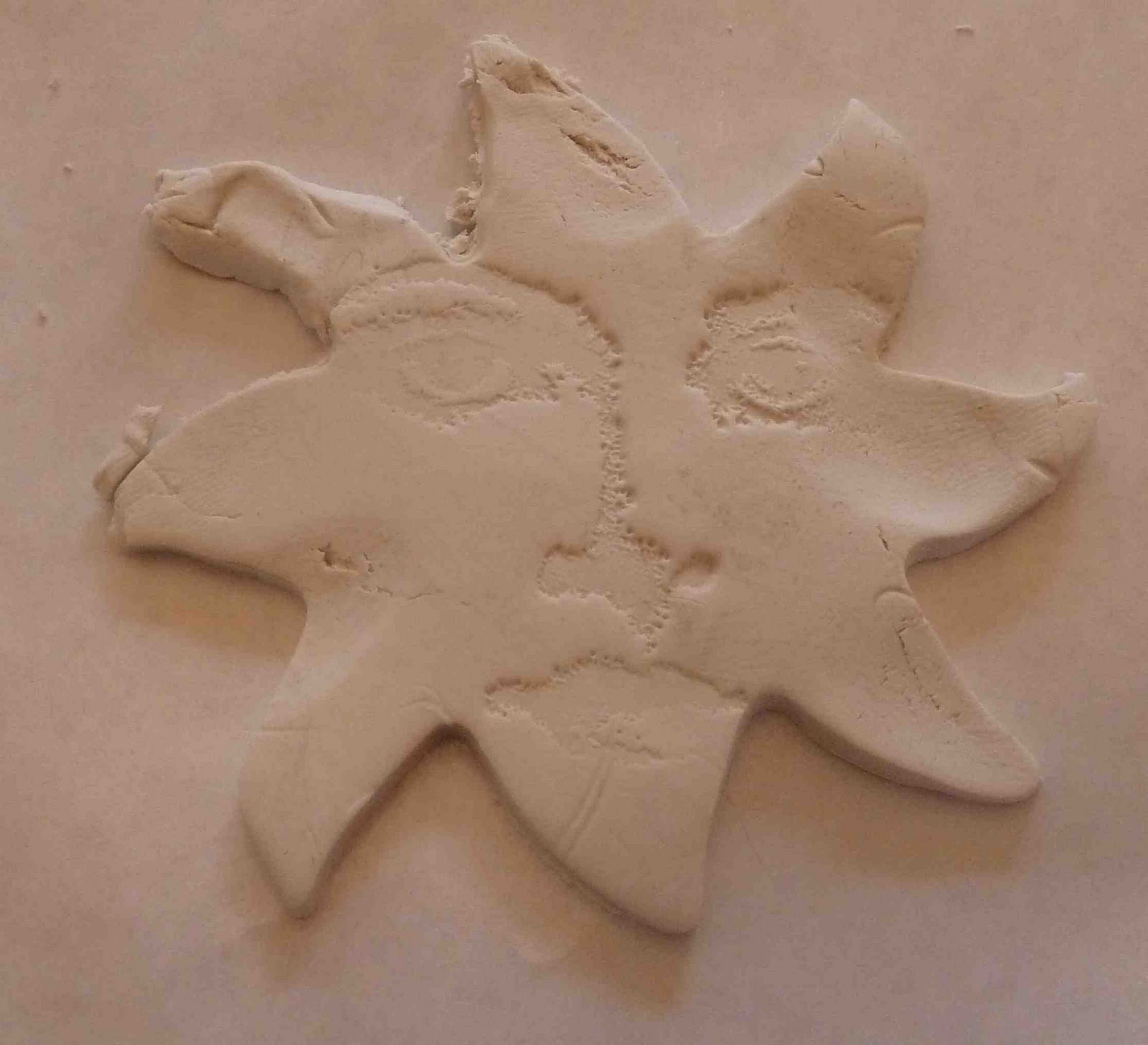
Now you can either stencil sun and star shapes onto the pot using acrylic paint, or create polymer clay suns and stars to glue on to the pot, as here, which gives the pot a fun 3-D look.

Follow the polymer clay instructions from Week 5, using sun and star-shaped cookie cutters to cut out the shapes.
Cutting out the sun shape with a cookie cutter
I stamped a face shape onto the sun for an interesting accent
Bake the polymer clay (again following the instructions from Week 5) and when it's cooled, paint it with acrylic paints.

Embellish your suns and stars however you like; I used glitter glued down with acrylic polymer medium for the sun faces, along with beads glued onto the sun faces for eyes and mouths, and beads scattered onto the stars. You could also add shine and color directly to unpainted polymer clay with pigment powder.

Glue your suns and stars onto the pot. This was the tricky part - because the pot was upright, the sun and stars kept wanting to slip down the sides of the pot. Blue painter's tape worked well to hold them in place while they dried.
Almost finished . . .
The pot was almost done, but it needed just a bit more pizzazz. Glitter spirals (using Stickles glue) did the trick.

Step 5: Varnish
Your pot will be weather resistant once you seal it with a protective coat of varnish. Brush on two coats of acrylic gloss varnish, letting the first coat dry before brushing on the second. Then . . . count the days until spring.

Update: have a look at Week 10 to see a stenciled version of this pot!

Sunday, February 6, 2011

Week 6: Grunge Valentine

I'm cool with the concept of Valentine's Day, but not the marketing. For example: those overpriced prix-fixe dinners where you're packed in like sardines. And the treacly pink and red frilly heart cards with pre-fab poems inside? Ick. For this week's project, let's make a card that's romantic but low-key -- camouflage colors rather than over-the-top faux romance.
No pink, red, or doily frills on this card.

What You Need

  • blank card (The Paper Company or Reflections)
  • art metal (Ten Seconds Studio)
  • art metal tools (paper stump, mold, sanding block)
  • pigment inks (Palette)
  • rubber stamps of your choice
  • alcohol inks (Adirondack)
  • alcohol ink applicator and applicator felt (Adirondack)
  • glue stick, tacky glue, and double-sided foam tape
  • wax paper
  • embellishments (ribbon, Dresden foil trim)

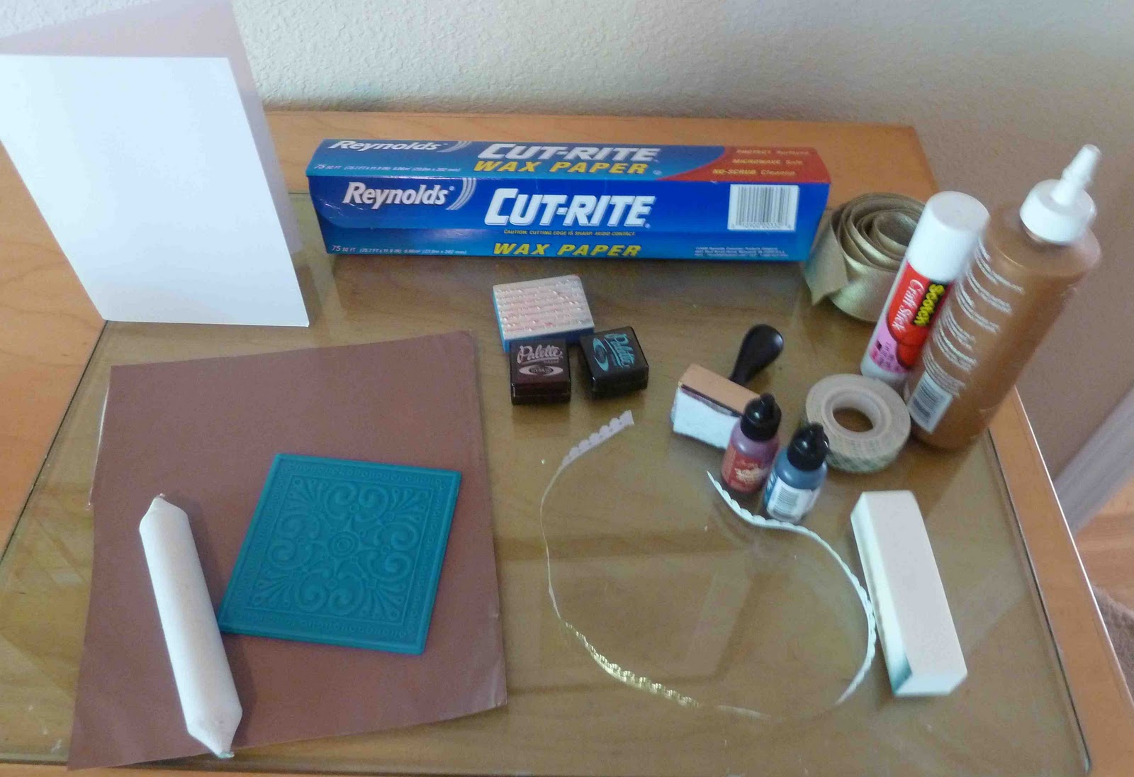
Note: you can buy all these supplies at a craft store, such as Michael's, except for the art metal (find it via Amazon) and the Dresden foil trim (www.vintageornaments.com)
What you need, clockwise from top left: blank card, wax paper, rubber stamp, ink pads, ribbon, glues and foam tape, alcohol inks and ink applicator, sanding block, Dresden foil trim, art metal, metal mold, paper stump.
This project mixes a few unusual supplies: art metal and alcohol inks. We worked with art metal in Week 3; this week we'll add in both regular pigment ink and alcohol ink to create layered backgrounds.

Step 1: Grungy background
Take some pigment ink and rub the stamp pad directly on the front of the card to add color all over it. I started with a base of sunflower yellow.
Rub the stamp pad directly onto the card.

Then, take a rubber stamp of your choice -- I had a stamp with various lovey-dovey quotations on it -- and stamp it uniformly all over the card.
Second inked layer: rubber stamped quotations

Then grab whatever color stamp pads you might have -- I happened to have some blue and green pads at hand -- and stamp them over the rubber stamped images until the background has a nice mottled look with different complementary colors. Tim Holtz Distress inks are great for creating an aged look; I don't own them (yet) so I made do with regular ink pads. Palette brand hybrid ink pads work well because they're low-moisture enough that they don't saturate the paper and cause it to curl.

Use a paper towel to blend the stamped colors, and when it looks mottled and aged enough, move on to Step 2.

Step 2: Art metal heart
Take a look back at Week 3 for instructions on how to work with art metal, which is a thin, colored metal that you can emboss and cut with scissors. Cut out a heart shape from the metal and emboss and distress it following the instructions from Week 3.
Distressing the metal with the sanding block

Now let's color the metal using alcohol inks: special inks you can use on glossy surfaces and metal. They have a transparent effect similar to watercolor; you apply them using a special applicator with a felt pad. Squeeze a few drops of different colors of ink onto the alcohol ink applicator and pounce them around the art metal until you're satisfied with the look. I used a few different applications of ink using different colors to create a mottled effect similar to the mottled card background.
Adding alcohol ink to the metal with the ink applicator. See how it creates a subdued, mottled effect.

Step 3: Alcohol ink background
We'll continue playing with alcohol inks by adding a background layer of wax paper covered with alcohol inks. Tear off a piece of wax paper. With a new piece of applicator felt, add some alcohol ink and pounce it over the glossy side of the wax paper. Use less ink for a more subdued effect, and more ink for a more richly toned effect.

With some ink left over on the applicator felt, I added some to the cardstock background too. On plain paper, the inks come out brown and blotchy - perfect for the aged, distressed look we're going for here.

Step 4: Putting it all together
Cut the inked wax paper into a square and glue it to the middle of the card with a glue stick. Cut small pieces of gold Dresden foil trim and glue them to the top left and bottom right borders of the wax paper. Then glue a piece of wide gold ribbon diagonally across the card with tacky glue, on top of the wax paper layer and the card background.

Cut small pieces of double-sided foam tape and stick them on the back of the piece of art metal heart, then affix the heart to the center of the card. The foam tape gives a nice 3-D effect to the card.

Take some wax paper remnants that have alcohol ink on them and cut thin borders with them. Glue those to the top and bottom of the card with a glue stick.

And there you have it: a decidedly unconventional Valentine's Day card.